Guide contents
Charts
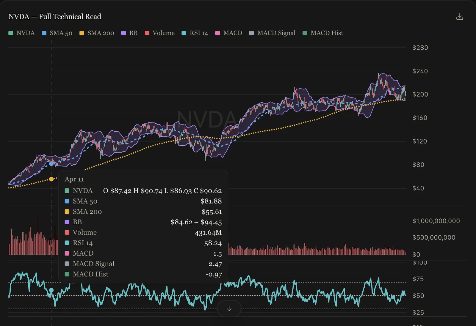
Ask for a chart in plain language — “chart NVDA with the 200-day and RSI” — and the analyst composes one. Charts are interactive: hover for exact values, and every series is fetched or computed server-side from the same audited data path as the written answer. The analyst decides what to plot; it never draws the numbers by hand.
Series types
Line, area, baseline, bar, candlestick, OHLC, and shaded band — mixable on one chart, with daily history or intraday resolutions down to one minute.
Indicators
Moving averages (SMA, EMA, WMA, DEMA, TEMA), RSI, ADX, Williams %R, standard deviation, MACD (line, signal, histogram), and Bollinger Bands — computed server-side and drawn as overlays or in their own panes (volume, RSI, and MACD stack as subpanes under the price).
Scales and comparisons
Normal, logarithmic, percentage, and indexed-to-100 modes — the last rebases every series to a common start for clean relative-performance comparisons.
Events and annotations
Earnings, dividend, and split markers can be pinned from the calendar data. The analyst can also annotate: points, horizontal levels (including levels that span only a date range, on whichever pane they belong to), vertical event lines, shaded regime bands with labels, and trend lines. Ask for them the way you’d mark up a printout.
Computed series
Spreads, ratios, rebased composites, rolling statistics — anything the sandbox computes can be charted alongside fetched series. See Calculations.
Can I get the data out?
Every chart card has a download button that exports the plotted series as CSV — exactly what’s on screen, ready for your own tools.